 Overbite
Why your Twitter banner is cut off on iPhone
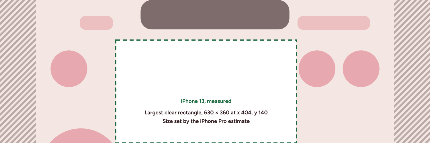
An X (Twitter) banner is cut off on iPhone because the app shows it in a box narrower than 3:1. On the iPhone 13 that box is 390×156, which removes about 125 pixels per side of a 1500×500 banner. Keep text between x 404 and x 1034, a range an estimated iPhone sets. Android was not measured.
Why is my Twitter banner cut off on iPhone?
The X app shows the banner in a box that is less wide than 3:1, and it fills that box the way a photo fills a frame. The banner scales until its height fits. The width is then too large for the box, so both sides fall off the screen. On the iPhone 13 you keep about 1250 of the 1500 pixels.
X's own note points somewhere else. X says "60 pixels on the top and bottom could be cropped" on different monitor sizes and browsers. The iPhone 13 result is different, because the app keeps the height and removes the sides. On our estimates, with iPhone 13 layout rules applied to their screens, the iPhone Pro loses about 162 pixels per side and the iPhone Pro Max about 107. If your name sits near an edge of the banner, suspect the side cut first.
Why does it look fine on a computer?
On web and tablet the banner box is 598×199, which is 3:1, so nothing is cut. You probably designed and checked your banner on a laptop, so you saw the best case. Mobile Safari has also been observed showing the full 3:1 banner, so the same profile can look complete in a phone browser and cut in the app.
That gives you a quick test. Open your profile in Safari on your iPhone, then in the X app. If the edges exist in one and not the other, the app's side cut is your problem.
What else can hide part of a banner on mobile?
The side cut is one of several things that can hide your banner. Find what you see in this table. Positions are in banner pixels, counted from the top-left corner.
| What you see | Likely cause | Where it reaches | Fix |
|---|---|---|---|
| Far left or right is missing | The X app cuts the sides | About 125 px per side on iPhone 13, about 162 px on iPhone Pro (estimated) | Move the layer inward, or shorten the line |
| Top middle is hidden | Notch or Dynamic Island | To y 104 on iPhone 13, y 140 on iPhone Pro (estimated) | Start text at y 140 or lower |
| Small text clashes with the clock | Status bar | Same band as the notch or island | Keep the top band free of detail |
| Round buttons sit on your text | Back, assistant and search buttons | To y 304 on iPhone 13, y 322 on iPhone Pro (estimated) | Keep text between x 404 and x 1034 |
| Bottom left is hidden | Profile picture | Up to y 317 and across to x 395 on web | Keep text right of x 404 |
Add these up and 45% of the banner area is covered on at least one of the five devices mapped here. On measured devices alone the figure is 37%. That is why a banner can look fine on one device and wrong on another, with no single place to blame.
How do you repair a banner that is cut off?
What you can do depends on how the banner was made. A banner with separate text and image layers can be repaired. A flattened image cannot, because its text is part of the picture.
If you still have the layers
- Rebuild the design in the banner editor, with each piece of text as its own layer.
- Add your profile picture so the preview matches your real profile.
- Click through the devices above the canvas and watch the preview.
- Read the warnings below the canvas. Each one names a layer, a device and the cause.
- Press Move it, or Fix all if several layers are flagged.
- Export the banner, upload it to X, and check it in the app.
If you only have a flattened image
Do not add it as an image layer. The editor imports a 1500×500 image at 900×300, Move it can only shrink that to 630×210, and over about 1000 pixels wide it cannot place the layer at all. Your banner would come back as a small card.
- Set the image as the background, in the Image option of the Background panel.
- Cover the old text, or use a version of the art without it.
- Rebuild the text as text layers, and let the warnings guide those.
The editor does not check text baked into a background image, because it only sees pixels there. You have to look at the preview on each device yourself. If you would rather start fresh, the free banner templates are all text layers.
What if your text is too wide to fit?
The largest clear rectangle is 630×360 pixels, so a long line at a large size will not fit on all five devices. The iPhone Pro estimate sets that size. On measured devices alone, meaning web, tablet and the iPhone 13, the largest clear rectangle is 647×397 at x 395, y 103. Break the line in two, since the area is tall enough to hold a stack. A smaller size also works, and the editor's warning tells you when the layer is too large to clear the profile picture.
The safe zone diagrams for each device show the exact shape you are working around.
Why is my banner cropped on a desktop browser?
That is a different problem. X says "60 pixels on the top and bottom could be cropped" on different monitor sizes and browsers. Our browser measurements at 1440, 1169, 820 show a full 3:1 box, but plan for X's figure. The largest clear rectangle stops at y 440 once you allow for it. Also confirm your upload is 1500×500. The banner size guide has the full spec.
Is the banner cut off on Android too?
We cannot say. Android was not measured, so nothing here describes it. The measurement notes list what was tested and what was not. If you use an Android phone, the quickest check is to look at your own profile after you upload.